Spotify: Conceptual Data Design
Music labels and artists want to know the value of Spotify. The insights team at Spotify needed new visual methods to discover, share and communicate findings from streaming data.
The Project
The insights team at Spotify London had questions: what is the point of maximum ROI for programmed streams per song? How much should music managers invest before putting on the brakes? When are the most important boost times?
To answer these questions, Spotify used their analytic models to investigate. But they kept running into a problem: how do we effectively communicate our findings in a way that both informs and excites people?
In addition, Spotify was interested in using visualization as a way to not only answer questions, but to ask new questions in the process.
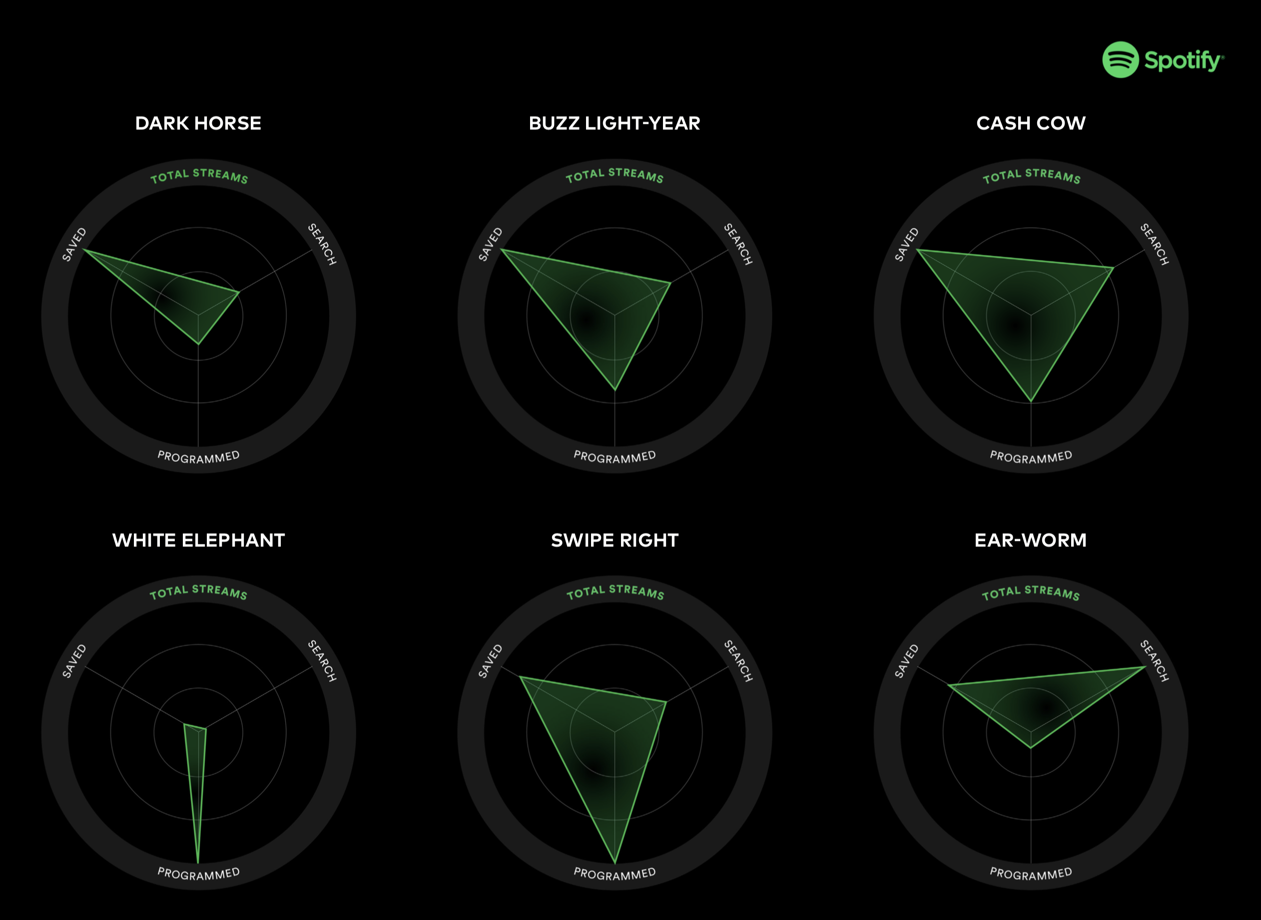
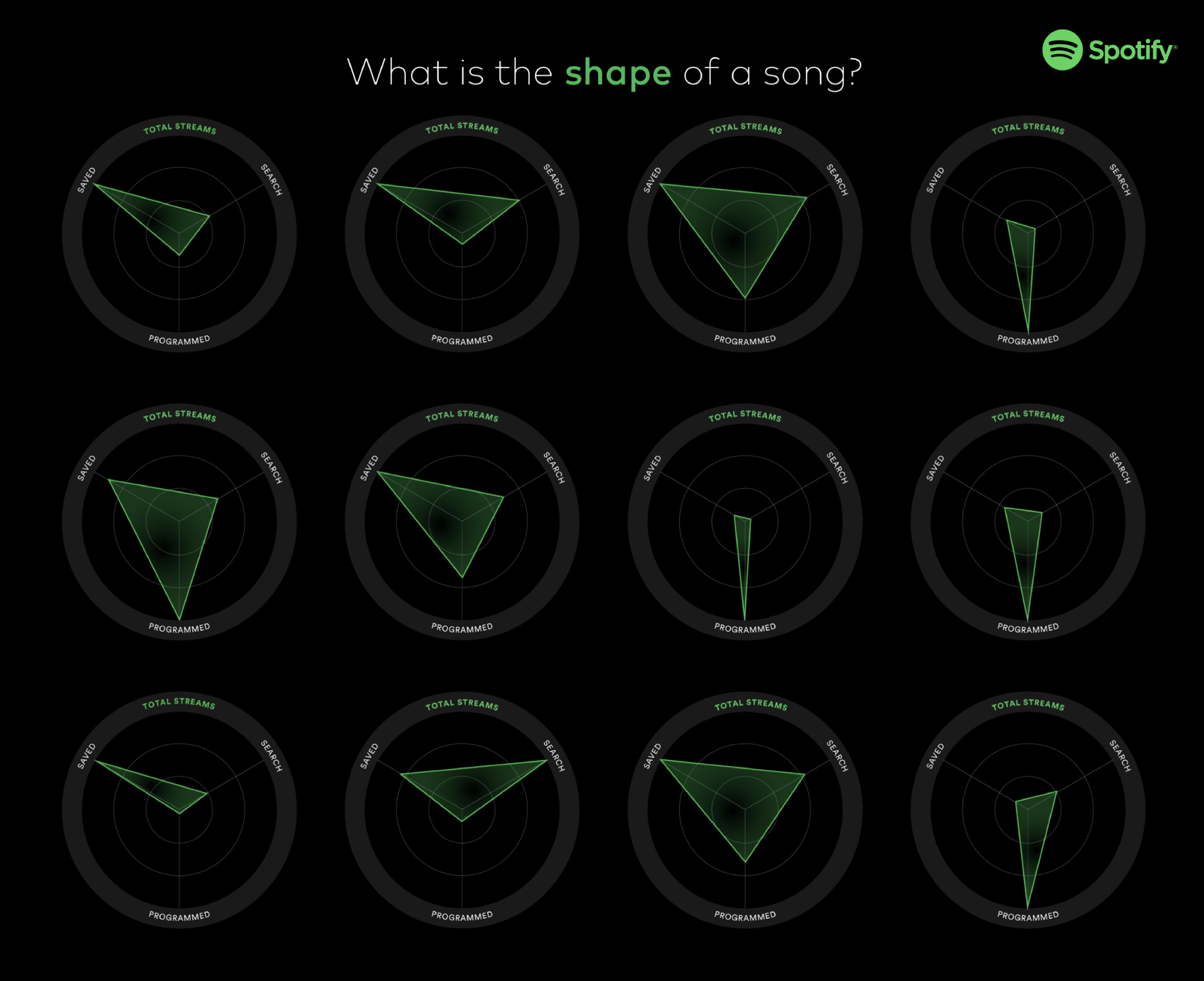
The core visual variable used in our concepts stemmed from a question: what is the shape of a song? I visualized the source of streaming revenue for each song as the point of a triangle. We then gave each "shape" a memorable name that suggests how the song will perform based on the types of streaming listens it is receiving.
Contribution
To start, I analyzed an anonymized dataset provided by Spotify. This data contained variables like date of song release, number of streams, artist, genre, and source of streaming. From this analysis, I created the visual metaphor of the shape of a song.
I then exported each song triangle and worked with a team of designers to build different concepts around each. We wanted to paint a picture for Spotify of what their future analytics platform could be. Because Spotify works with music managers, labels, and often the artists themselves, we wanted the methods of visualization to be both informative and exciting in a way that matched Spotify's brand.
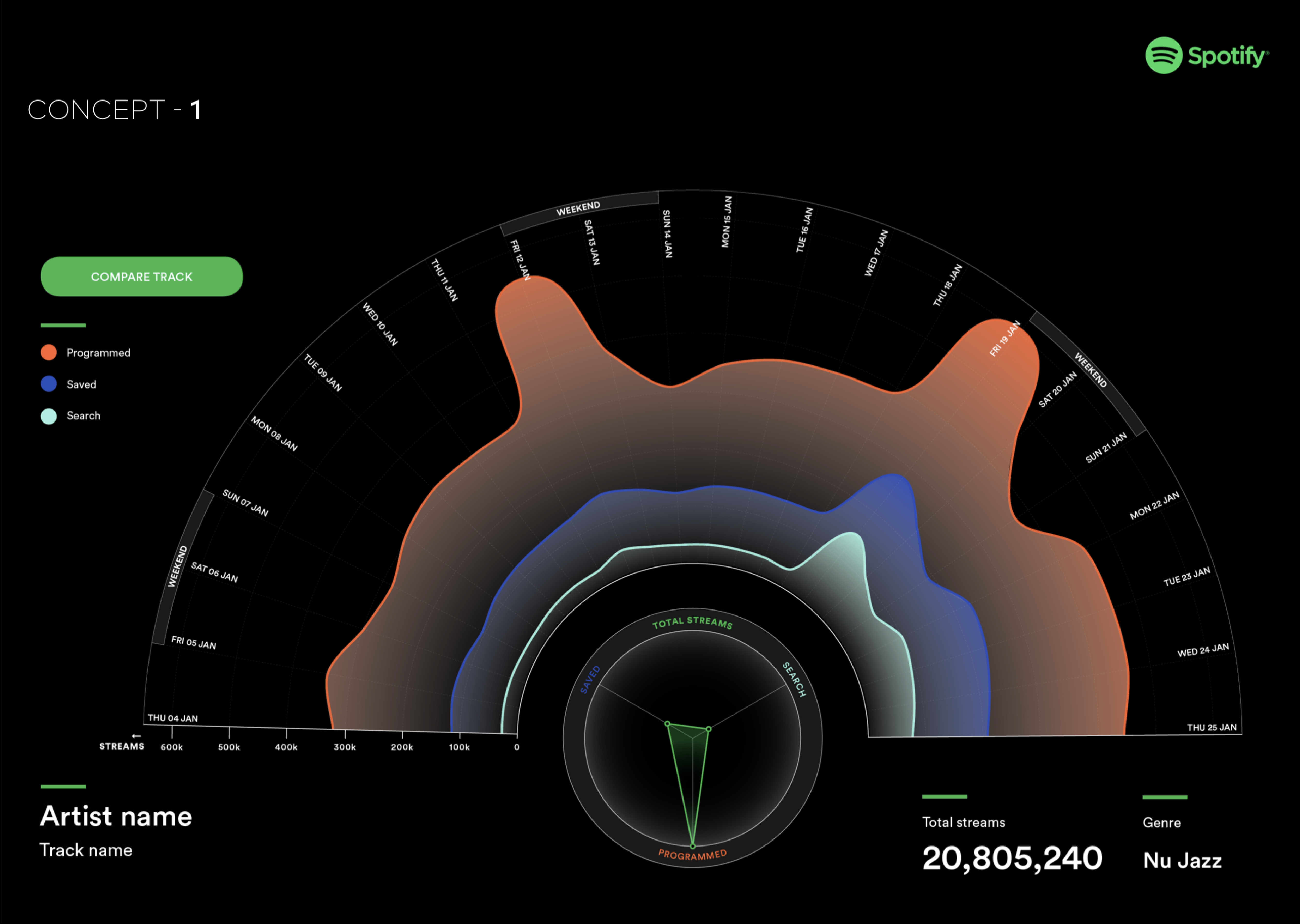
Day of week proved to be one of the most influential factors on a song's performance. This visualization uses a radial shape to visualize the three types of streaming across a two week period.
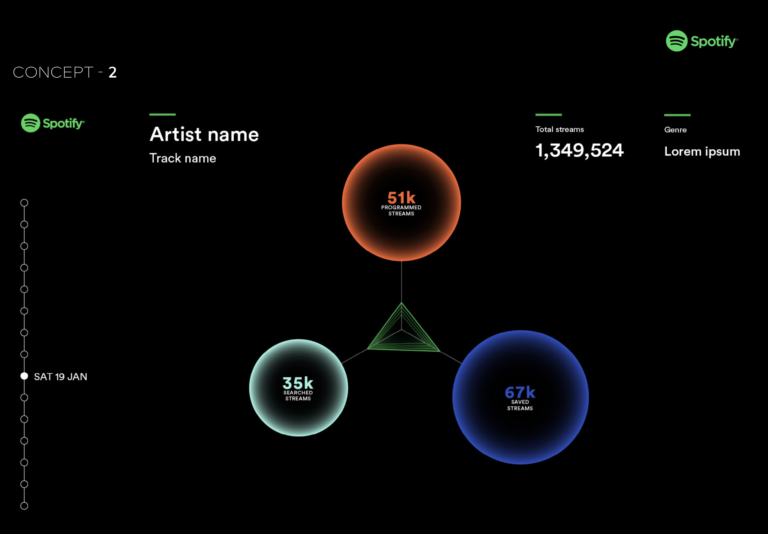
Another visualization took the form of an animated GIF. As the days go on, each bubble grows and pulls the triangle into a new shape.